About the film
Year: 2020
Director/DP: Tim Searfoss
Writers: Matt Jones, Tim Searfoss
Sound Mix: Matt Jones
About the film
Year: 2020
Director/DP: Tim Searfoss
Writers: Matt Jones, Tim Searfoss
Sound Mix: Matt Jones
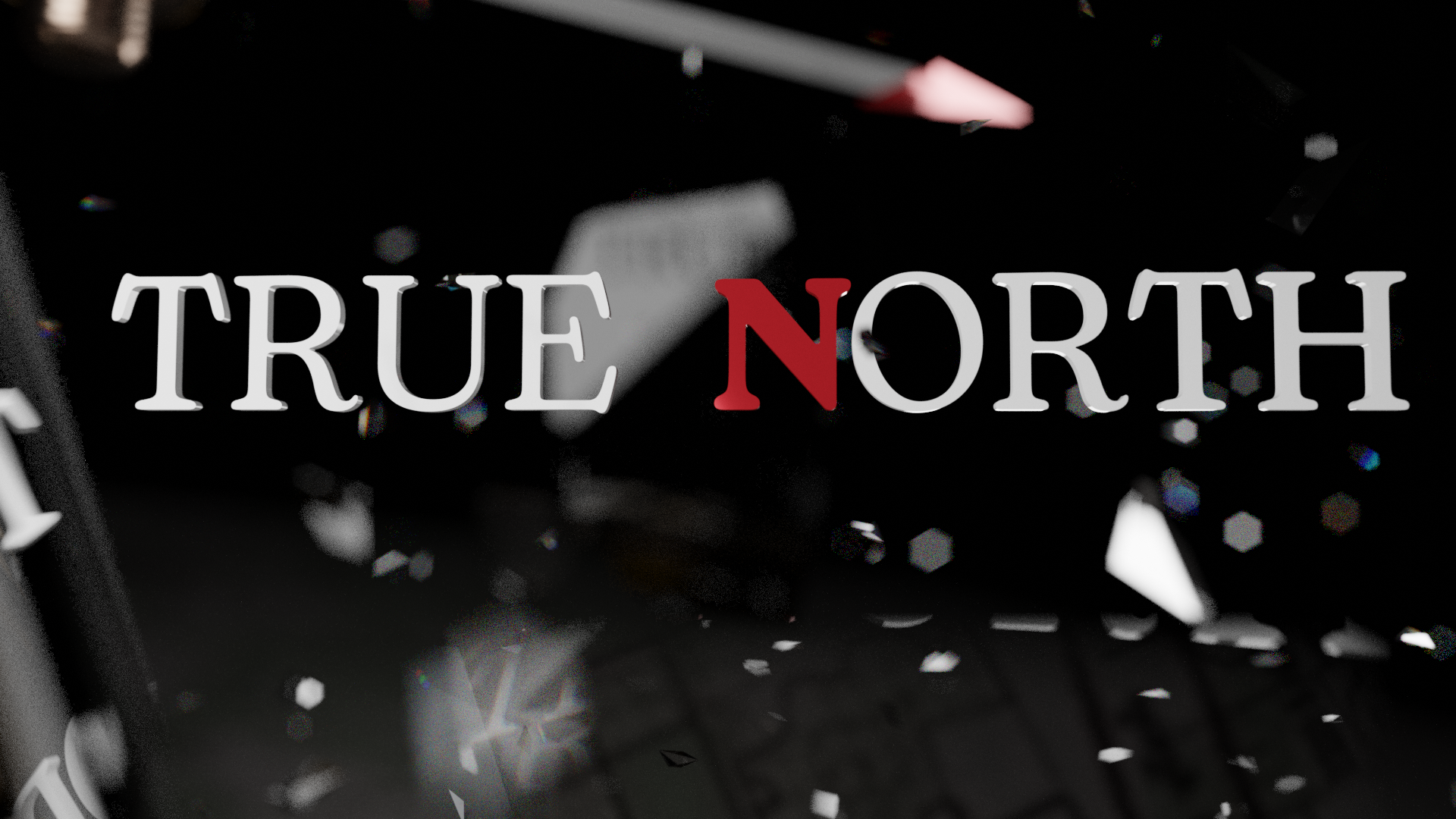
This video was created to introduce a new sermon series on the topic of apologetics entitled “True North”. The project centers around a compass that loses its effectiveness as confusion and noise about what the truth really is begins to get louder.
This project was concepted and created in 5 days using Blender 2.93. This project was a collaboration between myself and Danny Fajardo
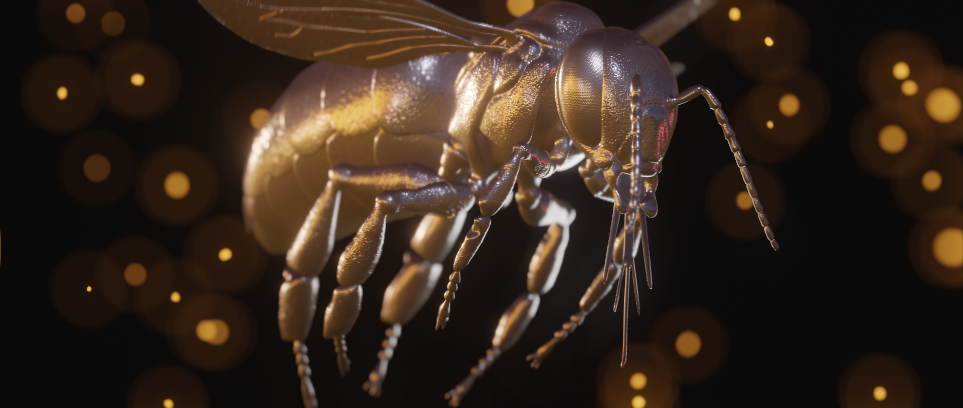
The goal of this project was to create a video highlighting the story of Samson in the Bible. The idea was to take elements of the story and film visual representations of each element. Before the project officially began, the first step for the team was to simply go back and re-read the story of Samson starting in Judges Chapter 13. After the refresher, the main symbols we ended up choosing were a lion (Judges 14:6), a honeybee (Judges 14:8) just one fox… not three hundred (Judges 15:3-5), dry grain going up in flames (Judges 15:5), a donkey’s jawbone (Judges 15:15), a knife cutting off locks of hair (Judges 16:19) and destroyed pillars and a pile of rubble (Judges 16:29-30).
Unfortunately, some of the props on our list (a statue of a honeybee, a donkey’s jawbone, and giant stone pillars) were either unrealistic to try to obtain, or very difficult to find with reasonable shipping times. As a result, those props had to be created in 3D.
Instead of getting a metal wasp figurine, we ended up going for a 3D model of a honeybee. In hindsight, that was a much better move. Originally, we were just going to sit the model in a scene and render out a few shots of it, much like the other shots of real statues. However, the model was posed with the wings stretch out to the sides, which wasn’t very aesthetically pleasing for an epic shot, but it did beg to be rigged.
The last time I tried to rig something, I tried for hours and hours and ended up having to hire a professional in order to meet the deadline, and ultimately didn’t even have the opportunity to use the final rigged model for animation.
This time, I was feeling ambitious, and I tried for a simple IK rig just to get some posing. I got everything working except the antennas. For some reason, I was seeing a large group of vertices getting left behind when I moved the bones, and I spend too much time trying to weight paint the antennas, and ended up abandoning the idea of making the antennas move. Later, I retried using the exact same method as before, and it worked perfectly. Not sure what happened.
Originally, we may have been a little too ambitious with the concept for the pillars. One of our first ideas was to have a shot of a pillar cracking up close, then cut to a wide of two pillars falling into each other, crumbling and breaking apart. Sounds like a great concept, and I started to work on it, but soon realized just how technically demanding those two shots were. So in an effort to hit the deadline, but still delier something cool, I changed strategies a bit. Instead of showing the destruction as it was happening, I opted to show destruction that had already happened. So I got to work creating the ruins.
With all the digital assets created and ready for the timeline, it was time to film the practical props. We tried to keep the amount of CG work to a minimum to keep turnaround time fast. Shoot day required us to capture a lion statue, a wolf (we couldn’t find any fox statues), burning grain (we didn’t have any proper grain, so we grabbed some long dry grasses from a swampy drainage channel behind our building) and Delilah cutting up a wig (you’ll see).
Still pretty stunned that our team was able to turn this video around in 3 days. Incredible job by everyone involved, and I’m extremely pleased with the final result.
Direction: Dan Fajardo, Matt Jones
Lighting: Shelly Bogard
Edit: Dan Fajardo
VFX: Matt Jones
Makeup: Katie Eldridge, Ana Womble
Talent: Lexi McLeod
Camera: RED Scarlet W
Lens: 70-200mm with 4x diopter
Collaborative project with Tim Searfoss
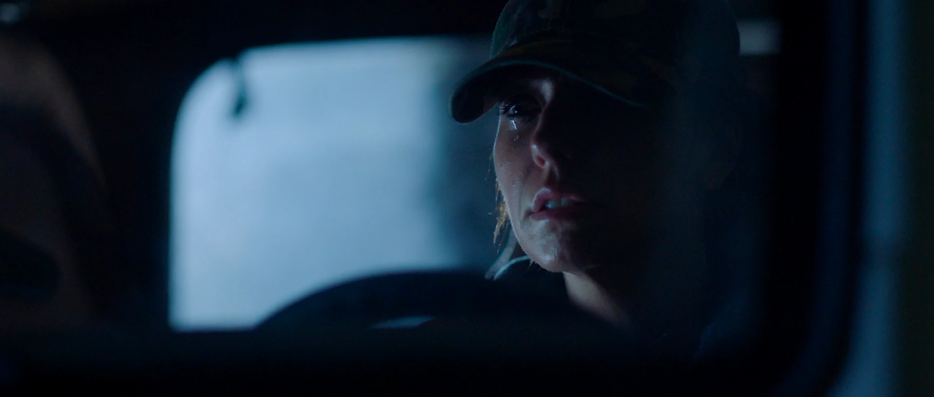
The challenge and inspiration with this project was to find a way to create a narrative story without leaning on the crutch of dialogue and without the use of a “normal” wide-angle lens. Everything in this video project was all shot on a macro, super-close lens.
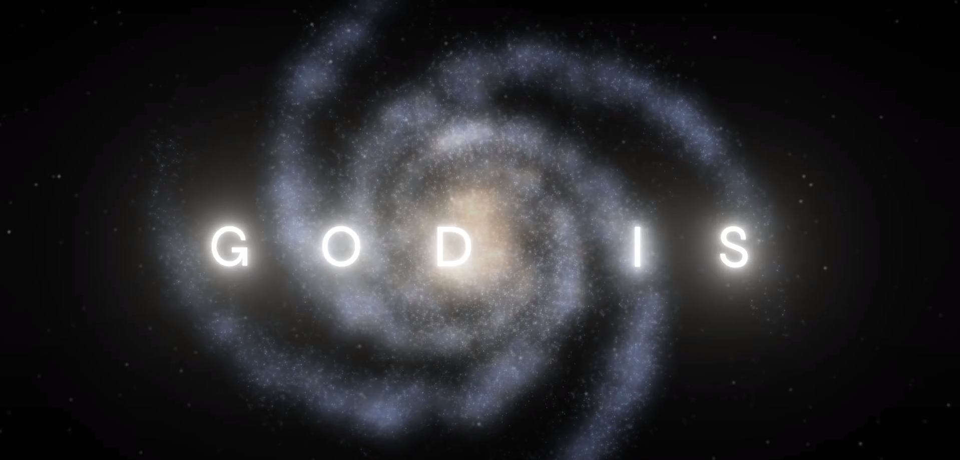
This week I managed to finish up a project that took the better part of a month to go through the concept, design, testing, and final delivery. This project was created for Grace Family Church to introduce a series entitled “God Is” which details the attributes of God and the bigness of God. My objective for this project was to support the ideas and the message behind the series, and essentially show the bigness of God (no pressure).
The concept started at the core of the message content. The bigness of God. When I think of the bigness of God, I think of how he created everything. Everything in the known universe. Everything from the tiniest atom all the way to the far edges of the cosmos. What we ended up doing was combining 43 layers of animations, videos, and still images to create an experience that felt like a single, continuous image.
The video below was one of the very first test renders of the opening shot of a DNA strand.
The result was a lot of fun to create and I learned more than I expected to. My creative journey has become really interesting at this point. While I still do video full time, I’ve started doing web development more seriously. I also delivered complete websites to clients the week after I finished this video!
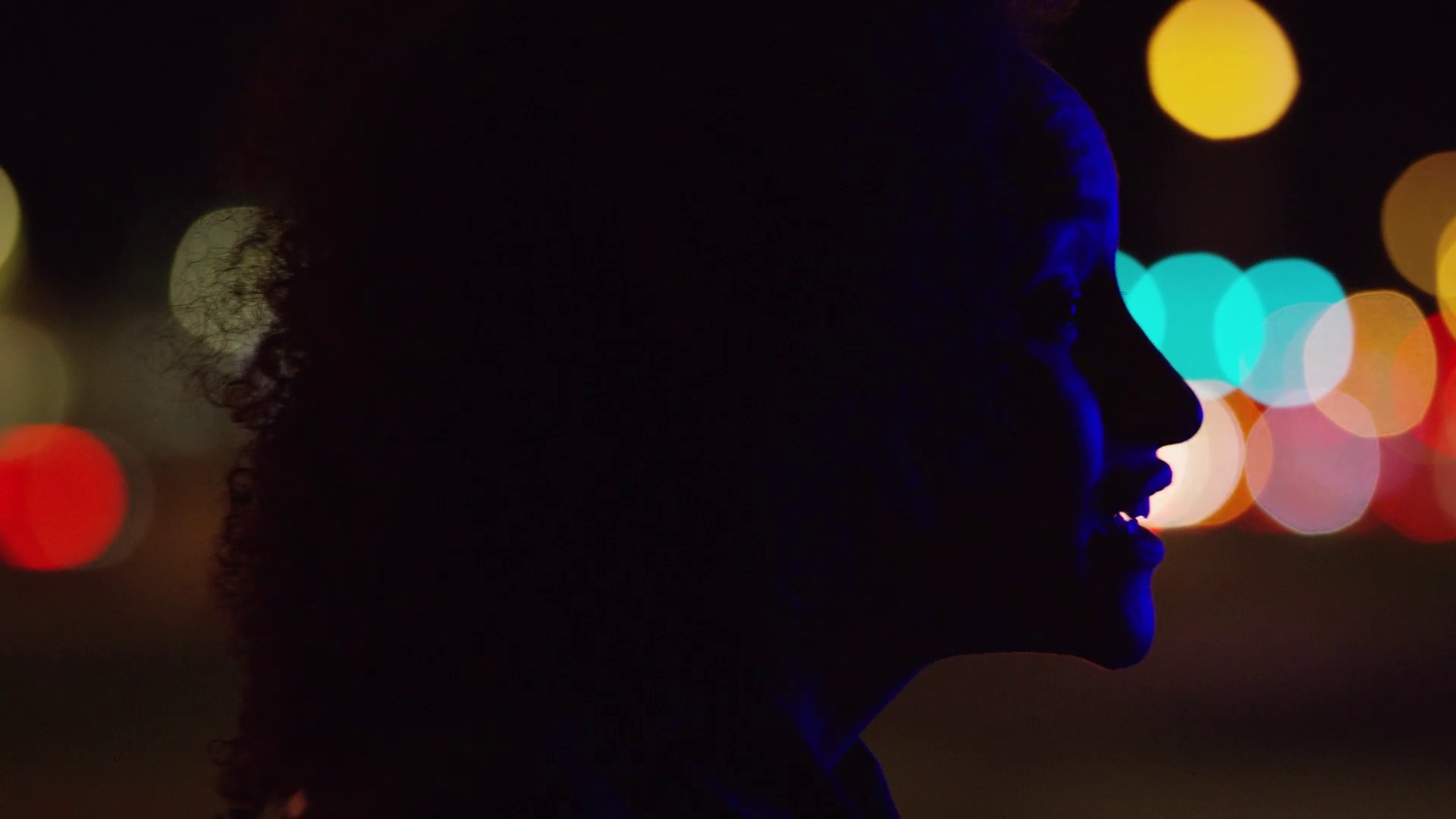
For this project, Tim Searfoss, Dan Fajardo, and myself had a very cool opportunity to work with the talented Quina Aragon, on a project entitled “Here Is The Church”. The project featured a spoken word piece performed by Quina and focused on the power of the church when it shows up in real life situations.
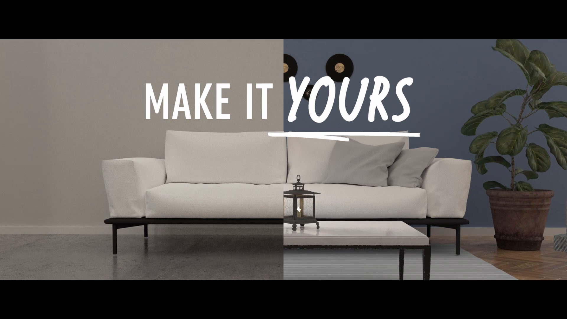
This project was, I think, the first completely 3D animation produced as a bump for a sermon series. It was easy enough to source the assets, but the biggest challenge of this project was completing it in a week or two on mid-2010 Mac Pros.
This project was more of a makeshift exercise in render management. Instead of worrying about how the animations were looking (every shot was just a simple camera move) it was more about commandeering every computer in the office that wasn’t in use in order to hit the two week deadline for delivery. Anyway, this was the project that prompted a pretty good computer upgrade!
Earlier this month I was asked to create a video to compliment an Easter graphics package designed around the theme of “Hills and Valleys”. Graphically, the idea was fairly minimal, with a simple blue/purple gradient behind white text. Below are the original mockups.


With the white silhouette of a mountain, and a blue/purple gradient, I got started on the accompanying animation. The concept was essentially to imagine what the graphic would look and feel like if you could open it and dive inside. What would the rest of this minimal, silhouette world look like? So over the next 5 days, I streamed over 10 hours and 30 minutes of content on Twitch, documenting my process. Below is the condensed version, sped up 20 times and set to music.
It took a lot of testing and experimentation to get the final look of the fly-through animation. Here are a handful of different render tests produced while developing the final look of the animation.

Technical stuff:
This is a VFX shot and edit sequence created for a short video in late March 2019. We couldn’t find the ideal location (an open field surrounding a lone tree) for this shot, and I needed too many specifics to match any stock footage. Short on time, I turned to Blender for the solution. All things considered, I’m pretty pleased with the shot. The entire composite took about 8 hours to design and create, plus and overnight render.


The project was filmed in less than 4 hours on an overcast morning. I tried to get as little of the sky as I possibly could, as I knew I’d be grading day-for-night. Below is the final result:
This year’s Christmas graphic package was a collaboration between photography, arts-and-crafts, and 3D modeling and animation.
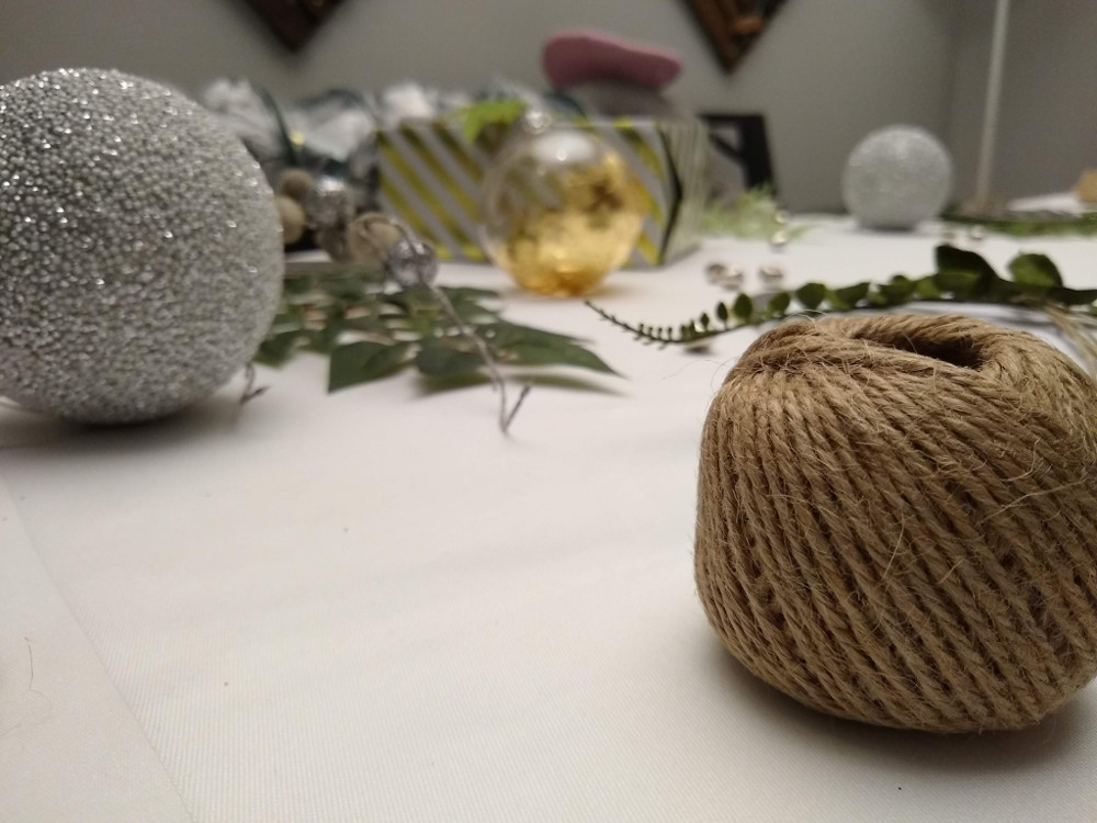
Once we had a flatlay that was acceptable for print, we needed to use the same objects or similar objects that reflected the same style to bring an animation to life. So the next step was taking some of the real-life assets and modeling them from scratch.
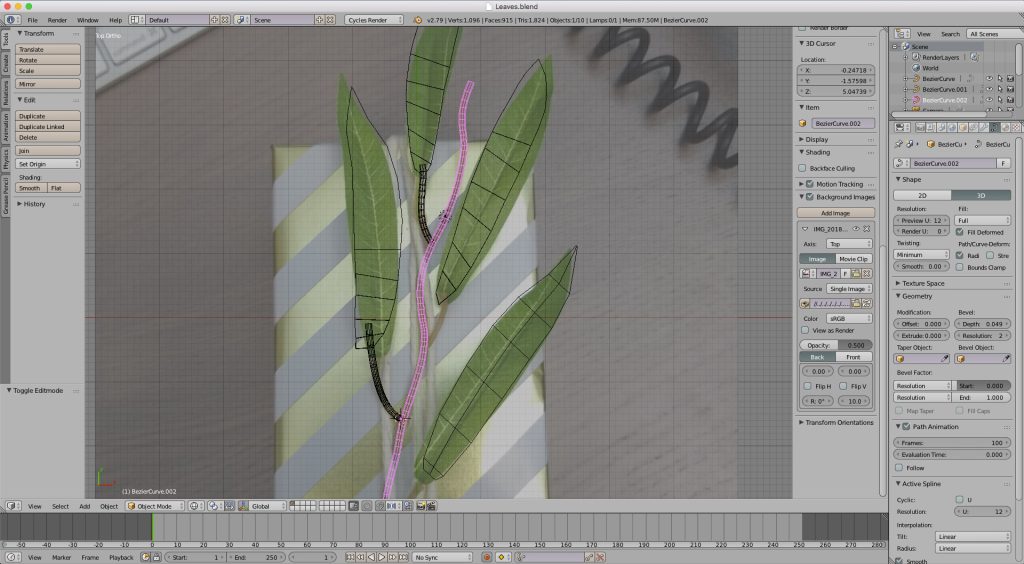
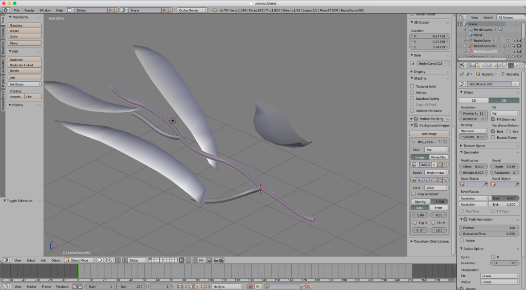
Once the basic model for the plant was created, it was time to model and texture the gift box, as well as the ribbon. In fact, one of the ribbons in this project is available for download over on Sketchfab.
Once all the assets were created, the only thing left to do was add a little animation to help bring everything else to life. I ended up adding a subtle ‘breathing’ animation to the Christmas tree, as well as some camera moves pushing through the scene.
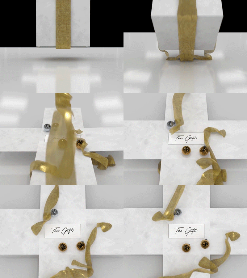
Originally, I had envisioned a present box that sort of ‘exploded’ with ribbon flying everywhere. The ribbons covered the camera lens for just long enough to enter a small ribbon sequence. Finally, they will fall to reveal the logo inside the box with ribbon lying everywhere on the floor. Time constrains ended up preventing this original vision from ever seeing the light of day. Maybe next year!